Naomi Yang, of Exact Change & Damon & Naomi, On Graphic Design
The following interview was conducted while I was a design student at the Pacific Northwest College of Art. One of our class assignments was to interview a favorite living designer. While many of my classmates chose superstar graphic designers such as David Carson, Stefan Sagmeister, and April Greiman, I instantly chose Naomi Yang of Exact Change. Perhaps more commonly known as a musician of Damon & Naomi and Galaxie 500 acclaim, Yang is actually both musician and designer. She is the graphic artist behind all the packaging for Galaxie 500 and Damon & Naomi, books published by Exact Change, as well as Web sites damonandnaomi.com and exactchange.com.
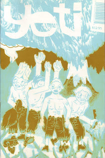
The interview was subsequently published in Yeti magazine, issue no. 3. Visit Yeti at this link.
 JOE CHAPPELL: I’ve read you were an undergraduate at Harvard. Did you receive formal design training there, or are you primarily a self-taught designer?
NAOMI YANG: I was a visual art major at Harvard; my senior thesis was in painting but I also did projects in photography, industrial design and landscape studies. I took one class in graphic design, but otherwise it was something that I did more outside of school. I designed posters for plays and concerts, and even a logo for the band that Damon and Dean were in (it was with another bass player—this was years before we started Galaxie 500). At that moment in rock history, every band needed a logo!
The summer before I went to Harvard I worked as an apprentice in Milton Glaser’s office in New York. In high school I had done a lot of poster design and Milton Glaser was my hero. I spent most of that summer making photostats. It was the only way you could change the size of the type that you ordered from a typesetter—otherwise you had to reorder all new type. The photostat machine was a huge camera-contraption with which you took a photo of the type, altering the percentage of the original, and then developing it inside the machine by sticking your arms through these holes and looking through a little light-safe window. And then, if you changed your mind, and decided you wanted yet a different size of type—you had to make another photostat!
But by the end of the summer they were also letting me do things such as letter spacing, which meant I took a strip of display type and glued it down with rubber cement to a board. And then I had to cut along the top and bottom edges of the type and between each letter, and look at the relationship of each letter to each other and if the spacing was even. If not, I had to slide each letter over a tiny bit until the spacing was perfect—then you made a fresh photostat of it so you had one without the cut lines to paste-up in the final artwork.
So, I guess I had a little formal training in some very old fashioned skills! When I first got a computer and Quark XPress, I was so happy—I couldn’t believe how easy it was to change the point size and letter spacing of the type!
JOE: I am familiar with your designs for Exact Change and the packaging of Galaxie 500 and Damon & Naomi albums. What other design jobs have you done? Is there any one project that stands out?
NAOMI: I’ve done a bunch of freelance work over the years, but I enjoy working on my own projects the most. Although I know part of the job of a graphic designer is to meet the client’s needs with fabulous invention, I tend to just be bummed out by a client’s needs! I am rarely inspired unless I can just do what I want. That said, many of the jobs I have done are for friends or people who like my work, which is always fun. They tend to let me do whatever I want.
JOE: What is your design philosophy and/or process? How do you work?
NAOMI: I am always drawn to the simple and the well-proportioned rather than the flashy. I often joke with Damon that if I started a design movement I would call it the “Plain style.” For covers, I tend to start with an image. I am always looking for one that has meaning and power on its own, and then usually give it center stage. I let the image dominate the design without a lot of interference from the type or other elements. As for process, I imagine it’s not so dissimilar to anyone else. I try a lot of things in order to find what seems to work best—different fonts, arrangements, etc. But I think, in trying to work out a design, that I tend to edit down, to remove things and change the proportions and placement, rather than add random elements. If I use something ornamental I like for it to have a “purpose” as well as being decorative—be it using a dingbat to set type off, or a barcode. I always aspire to have things look effortless and natural—rather than calling attention to the fact that it has been DESIGNED—hence, the “Plain style!”
JOE: As a publisher of experimental literature, what is your relationship to typography? How do you decide upon a particular typeface for a book?
NAOMI: I love typesetting prose; I enjoy a well-proportioned page so much! I worked in the rare book library at Harvard, in the manuscript department, during graduate school (well, as I was in the process of dropping out of architecture school) and I have a real love for medieval manuscripts and early printed books. The proportions of the type to the margins and the way the letters, printed with metal type, look are just so beautiful—they are wonderful objects.
So I try and create that kind of feel in our offset-printed Mac-typeset books and in our CD packaging. I try to have a luxury to the proportions of the page, a ceremony to the flow of the front matter, and a bit of whimsy in the details, like the running heads and the page numbers. I always hope that the packaging of the book or the CD will be a little world unto itself (not to mention that music will be too).
Choosing fonts is usually just a matter of feel. I love both the old-style fonts with a lot of contrast between thicks and thins and eccentricities, such as Didot or Centaur, while I also love a lot of sans-serif types, such as DIN or Gill. I hate Times Roman and all those types that have no personality!!!
JOE: Who are some of your favorite graphic designers, past or present, and what in particular attracts you to their work?
NAOMI: Well, as I said before, when I was very young Milton Glaser was very important to me. I think that my love for the powerful image resonated with his incredible drawings. With just a few simple lines he could express so much. And his work is always so clever and funny too.
Later, as I discovered post-punk music, the work of (Factory Records designer) Peter Saville was very important to me. Everything about his work always is so elegant; so few elements but chosen so carefully. I always think of Peter Saville’s covers and (Joy Division/ New Order musician) Peter Hook’s bass lines at the heart of my early thinking about design and music.
Another designer that I have always loved is Bruce Rogers—there’s not so much information available about him, but he was a book designer from the early part of the century who did incredibly whimsical and inventive things with type ornaments. He also designed the typeface “Centaur.” I have always loved everything I have seen of his, especially his great title pages (if you can find a book called Books and Printing: a Treasury for Typophile by Paul A. Bennett, there is an essay about Bruce Rogers in it with some samples). And also on the list would have to be: Bruce Mau (Zone Books); Louise Fili; and Illiazd (European, worked with the Surrealists—did an amazing book with Max Ernst called Maxmiliana), and the Bauhaus graphic designers. Not to mention a long list of architects, painters, photographers, whose work I love!
JOE: As a musician, does music also influence your visual work? Do you find you approach music and design in a similar fashion, or is the process quite different for each?
NAOMI: I don’t think my music necessarily directly influences my visual work or vice versa. They are such different media. But I do think that naturally a lot of the same aesthetic principles are there in both. I am the same person, after all, making all the choices—bad and good! Making something that is beautiful is always my number one desire, and in both making music and art I definitely favor a process of tinkering, stripping down the elements, hopefully leaving just what is lovely and valuable and direct.
JOE: Among fine art circles, and perhaps even art schools, there has often been a disdain for graphic design because of its underlying commercial orientation. What are your thoughts regarding the line separating fine art and graphic design?
NAOMI: I had that question myself for years—but, for me, it was not just about graphic design vs. fine art, but about music vs. fine art too. I had originally wanted to be a painter and when I dropped out of architecture school it was to paint as well as play music. But, as Galaxie 500 was doing so well that I had no time to paint, I felt worried that it wasn’t really spending my time making art, it was pop culture, and somehow a much less valuable pursuit than painting. I suffered a lot of anxiety about that as we toured and spent all our time on music—that I was not attending to the real art that I hoped to make. Graphic design certainly posed a similar problem to me. It was fun, like music, not solitary and miserable, like painting, and therefore not as worthy.
But I came to realize, slowly, after G500 broke up, and a lot of thinking about things later, that really everything can be art and everything can be turned into a commodity, so that it’s up to you just to choose what you want to do and do it well and with soul. The fine art world CERTAINLY takes commerciality into consideration and, it is certainly true that music and graphic art can be beautiful and moving. So in the end I think it’s just about trying to do something real and sincere.
JOE: Do you have any advice in particular for a young designer just starting out?
NAOMI: I have never tried to make a career out of graphic design; it’s just been something I have always done, so I don’t know if I have any wise advice... I guess it would just be “please make beautiful things—the world needs them!”
Final Thoughts and Peace of Mind
There is much to learn and continue learning from the knowledge and innovations that surround us every day of our lives and the wisdom imparted by Naomi may just go some way to assisting that process in some way. Hopefully, the interview provided you, the reader with a great deal to think about and mull over without having to resort to strict mind discipline techniques or self regulation in any way. However you mentally process and assimilate what you have just read, remember that you should always trust your own judgement and listen to your hunches!